"How?", you ask. Well, I'll show you......
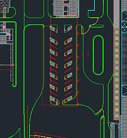
The image below shows a certain area of a proposed development. The green lines are pavement lines. Almost located directly in the center of the image, are booths with parking spaces. All this area must be flat enough to be ADA compliant and have enough grade to drain.
So...now that you have the 2D layout of the site.....you hopefully have come up with some 3D breaklines that function within the site.
A brief example of using grading feature lines is shown below. The idea with this post is not to show how to grade, but how to analyze the proposed grading.
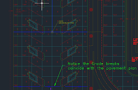
Notice above, the yellow/brown line that has triangles on it. This is a grading feature line, and the open elevation editor on the bottom right hand of the screen shot is displaying those values. Using the elevation editor dialogue box, you can ensure your longitudinal grades aren't too steep and possibly have enough pitch if a curb and gutter is being used. The blue lines you see above, that weren't displayed in the first image, are site breakline locations. This is were the concrete joints will change grades. And since it is concrete, these breaklines must coincide with a concrete PCC plan. For further explanation see the image below:
You'll note that the dark blue lines coincide with the pavement joints (cyan lines). This sometimes end up being quite an iterative and tedious process. Don't expect this to work on the first try.
For further ideas of the grading process, see the image below:
You can see from the image above that a blue grading breakline is selected. This breakline also has a low point in the center that is where the proposed catch basin will ultimately be located. Notice the grades on either side of the catch basin are approximately 1% and the CB elevation is 4039.370 (Panoramic View above).
Now assuming you've made it through grades that seem to work and tie into surrounding areas, you typically will look at the contours. But are the contours enough to see detail where this may exceed desired slopes, especially in areas that may be too flat?
Below is an image with the contours......
You can see through the parking area there isn't very many contours lines through the paved area....and this is good, unless it's too flat. You can also see on the left and right side there are contour line drop offs but we don't know exactly the slope unless we investigate further. It becomes difficult to look at this each time a grading change occurs because sometimes the problem areas occur where you tie back in, and you are not looking at that area at that time. An area that may have had a 1% minimum slope before may now have been altered to have a flat spot. NO GOOD! So rather than looking at each individual grade that way, I would expedite the process using a visual surface that provides more than contours.
DO THIS AS SHOWN BELOW:
1) Create a new surface style named "Slopes" or something similar that you would understand the concept purpose of the newly created style.
2) Once you create the style adjust the Analysis tab similar to what is shown below. Of course, feel free to add more or less ranges. I used something easy to remember. The new style would produce: RED if too flat. GREEN if within range and YELLOW if bordering on too steep for pavement. I used two more ranges for earthwork ranges.
Now apply that surface style to the surface....
And as a mentioned you should keep coming back to this view for a quick visual to see any red flags. Just for fun.....let's change the elevation of the catch basin up +5' and see the resulting visual.........Result shown below......
The magenta donut is to accentuate the location of the catch basin. Notice the replacement of the green scheme colors by brown. This shows that this area is NOW too steep and needs to be reworked.
I hope this visual trick helps you. I know it helped me avoid flat spots in grading, that could hinder pavement drainage.
Hope this helps!
George
Have any questions?...please email me


No comments:
Post a Comment